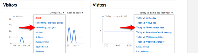
We have a new trend comparison option that lets you compare reports and graphs vs the same date or date range from the previous year. For example, April 6 2014 vs April 6 2013, or April 1-6 2014 vs April 1-6 2013.
You can see this new option in the date menu for any graph:
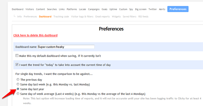
You can also set this as your default trend option in your dashboard preferences. In this case, “vs last year” will always be the default graph comparison, but “last year” will also be used in to calculate the trends we report (the red/green percentages next to each number in most reports).