Almost 3 months in the oven, we are finally ready to release a BETA of our path analysis feature. We’re releasing as beta because there are still a few quirks and we want your bugs reports and feedback on the interface and what you think it could do better. This is a Pro or higher feature, of course.
Part of what took so long was making it fast, because we know our visitor filtering isn’t exactly the fastest thing in the world, especially for high traffic sites over large date ranges. But we are limiting this to a maximum range of 31 days at once for the time being, to make sure resource usage doesn’t get too ridiculous, until we know how you are using it.
There are two different features in this release.
Simple path analysis
I like this one because it’s quick and dirty and requires zero forethought. When viewing your Content or Events reports (planning to add downloads and outbounds later), you’ll see an icon next to each item:
![]()
Click this icon (not the star, the other one!) to see an inline popup of the top 30 next and previous pages, for whatever date range you are viewing. If you’re interested in seeing top next/previous pages for a page listed in there, click it and it will keep on going. Here’s a good example for our upgrade page:
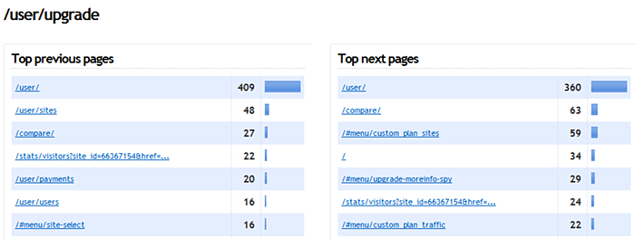
The top previous page is /user/. Makes sense as that’s the starting point for most registered visitors, and there are links to upgrade right from that page.
Second previous page is /user/sites – this is where people register new sites on Clicky. If they’re at or over their limits for how many sites they can track or how much traffic they’re allowed, we prompt them to upgrade first.
Third previous page is /compare/, which is our competitor comparison matrix. From our upgrade page, we have a link to this comparison matrix, so people can compare our pricing and feature set, which we think will help win over more customers since most of our competitors are 400+% more expensive than us (ouch!). So how would this be a previous page? Well, after people look at it, they go back to the upgrade page! Well, some of them anyways 😐
The next two aren’t horribly relevant but the sixth one, /user/users is. That’s where you add additional user accounts. If you’re at your user limit or your account doesn’t have access to that feature, then we say, hey, you gotta upgrade!
I could go on all day but the point is simply that seeing what pages are actually pushing people towards paying us for our service is extremely interesting. I of course had a hunch about these most popular paths since I designed the entire flow of our web site, but I didn’t actually know. Now I do and it’s great!
Real path analysis
This other aspect is much more powerful but takes longer to setup. That’s to be expected of course, and if you take the time to do so it is pretty fantastic. In the future, we plan to group this together with goals for multi-step funnels. That’s not making the initial cut though.
To reach this report, go to Content, then the Path Analysis sub-tab. It gives a brief overview of how to use it. Click the link at the top to start analyzing. Once you enter in some paths and click “run analysis” on the bottom right, it will analyze your input and return a report like the one below. This example is fairly simplistic but I don’t want to showcase too many private details of our business here.

Until we integrate this into goals, you can use this as a kind of faux multi-funnel goal system, because you can save paths to quickly access them later.
Important note: In the screenshot above, see how the green arrow on the right has a little “break” in it? This represents “infinite” steps in between each path. In other words, it means the visitor didn’t necessary go directly from the first page to the next, but after viewing the first they eventually viewed the second one. This is always the default when adding new paths in this interface. But if you only want to analyze direct path 1 -> path 2 flow, just click that arrow and it will become closed, representing a direct step:

After you make that change, you will have to click the Run Analysis button again. In fact, any change you make in this interface you will have to do that. The reason for this is if we were auto refreshing it with every change you made, it would take a lot longer to create exactly the report you want. So instead, we let you do all the steps you want first, and only process it when you tell us too. This is an important note because it works differently than all other reports on Clicky, which all react instantly to anything you click.
So, play around with it and let us know of any bugs you find or additional features you’d like. Barring any serious bugs, we’re going to take at least a few weeks break from this because we could really use it. So we’d expect that the “official” release with some of your suggestions and hopefully all bug fixes would be out in about 1 month.