
In just a short span of time, mobile phones have already become a significant necessity in life. In fact, it has become necessary not just for socialization, but also for entertainment, security, status, identity, and professional work and business.
Despite this, mobile phones are still only as important as the tasks that they can do for their owners. And when it comes to smartphones, tasks are typically handled by mobile apps. With apps, mobile phones allow us to do a whole load of things, from controlling our home appliances to communicating with our loved ones from thousands of miles away.
Over three out of four millennial mobile users have admitted to regularly opening apps out of boredom. More importantly, a large number of users have no qualms about deleting an app if it doesn’t look aesthetically pleasing. This means that the app design doesn’t just have to be user-friendly, it also has to look good for users to continue using it.
Due to this, companies have become adamant about making sure that the app design will not get in the way of their business. This has turned into a problem for designers who now have to consider how to balance functionality with aesthetics.
The mobile trend
Due to mobile phones’ affordability and portability compared to laptops and desktop computers, more than 5 billion people now have mobile devices, of which 3.2 billion are smartphones.
Additionally, research shows that mobile users spend up to 87% of their time using apps instead of on the web. As the number of released apps increases, so does the number of people who download and use these apps. Subsequently, not only are most websites now designed to fit mobile use, companies are also starting to develop and release mobile applications for the consumers’ ease of use.
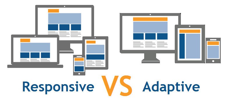
Responsive vs Adaptive
Responsive app design
The first type of mobile app design is called ‘responsive’. With responsive design, the layout dynamically changes according to the screen size of the device display. The contents are rearranged in the interface to fit the screen size and allow for a seamless browsing experience.
 Prior to this, mobile web designs often excluded content and functionality that may be relevant to or occasionally preferred by some users. Responsive design addresses this issue by prioritizing content and feature parity across different layout versions of the app or mobile site, which helps to boost performance as well.
Using CSS media queries to resize page aspects, graphic designers only need to create one version of the app design and implement it, making it much easier to maintain. Despite being more laborious to develop, it is actually more budget-friendly in the long run since it can save companies money on content and feature maintenance compared to having separate sites to maintain.
In short, a responsive design strategy is straightforward, fluid, and particularly suitable for content-heavy applications such as fiction apps and news and blog apps.
Adaptive app design
Unlike responsive design, adaptive design displays different static layouts according to the screen width of the mobile device, which generally comes 320, 480, 760, 960 1200, and 1600.
Although the elements on the interface are displayed differently on various screen displays, the optimized browsing experience leads to faster loading times across all devices. Even advertisements appearing on the app can be optimized by the designers. Adaptive app designs are mostly used by apps that require extensive interaction with users, such as e-commerce and banking apps, because of the need for faster loading times.
However, designing and creating apps using the adaptive app design is more expensive and laborious than responsive design. Normally, at least six designs need to be developed, corresponding to the different widths of mobile devices. In addition, updates on the design have to be specifically made for all layouts.
With phone sizes, and therefore screen sizes, being greatly varied and always coming out with new ones, adaptive design is quite difficult to maintain and most probably would require a team of developers and graphic designers. But if the priority is faster loading times, then adaptive app design should be the first choice. In fact, an adaptive design is easily one of the best ways to speed up the mobile version of your site if it’s running slowly.
In general, it is important to know and understand, especially for graphic designers in charge of designing the app, that mobile apps should be designed by usability first and foremost. If users can’t accomplish whatever they opened the app for due to its user interface, user experience is pointless, and deleting the app is just a few clicks away. This is obviously not helpful for increasing conversion rates, a metric that is very important to companies and businesses.
Best practices in app design
App and mobile site design have two areas to consider: user experience (UX), which focuses on the effective and enjoyable use of the product, and user interface (UI), which describes the presentation and interactivity of the app.
The best practices in designing apps and even in designing mobiles websites, ensures that UX and UI are complementary. This is regardless of whether designers choose to go with a responsive or an adaptive design strategy.
Be selective about your app maker
First and foremost, you should research which app maker you plan to use to create your app. Think carefully of how you want your app to look before you choose an app maker.
The human brain can only process so much, so it’s important to make sure that sections are organized. There are two reasons for this. One, content should be minimized on each page to provide the user with only the information they need at the moment; and two, interface elements kept to a minimum can help make the user more at ease with the app.
The best app-making software will allow you to design your apps with a variety of built-in templates that keep content to a minimum like described above, make it easy to perform tasks such as uploading your company logo, and offer cross platform availability across Android, iOS, and Windows.
Offload and resize tasks
Making sure that users exert additional effort as little as possible should be one of your top priorities when designing an enterprise-level mobile app. Ideally, all the important buttons should already be on the homepage, because the easier it is for them to get to the feature they need, the better.
If it is unavoidable, it’s better to divide the tasks into bite-sized chunks that are simple enough for users to understand. Remove unnecessary fields and keep the forms as short as possible, requiring only the bare minimum to avoid input error.
Use visual weighing
The most important element on the current display should have the most visual weight. Whether in color, size, or contrast, it should easily be the most noticeable thing on the screen. With regards to content, make sure that contents are optimized to the device display size and are easy to read. There should be headings to create a hierarchy on text-heavy pages so users can skim pages quickly.
Have quality imagery
It is important to use quality imagery in the apps since it is easier to fit images and icons that convey as much information as entire phrases of texts on the limited screen size of mobile devices. The use of Scalable Vector Graphics (SVGs) for illustrations and icons is also recommended because it is infinitely scalable. Additionally, SVGs are also smaller in size and can help boost loading times.
Boost security with a VPN
Apps should always be designed with security in mind as a top priority before any mock-ups are even created. The goal behind UI and UX is not just to display information like we’ve been discussing so far, it’s also to only display information that users are allowed to see. Furthermore, if your app requires users to put in any personal or financial information, security and privacy is even more important as cybercrime has been rising significantly since the pandemic hit.

The good news is that there are many things you can do to boost the security of your mobile apps, and one of the most effective is to rely on a virtual private network (or VPN). VPNs are designed to encrypt company and customer data to hide such data from hackers. What’s more, VPNs are incredibly inexpensive as well, and a quick review of the best free VPN apps available today shows that, indeed, they will not cost you a penny.
With this in mind, and when you consider the enormous financial repercussions that can happen if you are the victim of a cyberattack, there’s really no excuse not to have a VPN up and running. Each time you plan on taking customer data collected on your business apps, you should have a VPN installed
Standardize interactive elements
Elements should be kept predictable and familiar. The way an object looks or a text reads should easily tell the users how to use it or what it is for. Buttons, especially important ones like the “Back” buttons, and links should be large enough for human finger tapping.
It should also work properly so users can easily go back and make corrections without being led all the way to the home screen. Aside from showing different colors, there should also be a warning message or visual symbol to indicate invalid input so even color-blind users can see their errors.
Conclusion
Even though mobile websites get more visitors than mobile apps, visitors actually spend more time in mobile apps than they do on the web. This is why you have to make sure that the design strategy and practices you used to develop your app will give your users the total UI-UX package, regardless of which design strategy you use to develop the app. Remember, creating a clutter-free and user-friendly app should still remain to be the priority of all app and web design practices.