When we introduced the new line graphs, one key feature of Clicky was removed because it was quite challenging to implement in this new flash software, and we didn’t want major differences between the two different views. Also, I was feeling lazy.
This feature was that if you selected “last week” (for example), it wouldn’t just show you the individual days from that week, but instead summed up the total and showed you that number, and went back 11 more periods of the same amount of time and showed you the sum for each of those periods as well. People were using this to easily view monthly and weekly summaries of visitors and actions.
I stupidly assumed no one was using this, but based on the complaints received, I was completely wrong. We hear you loud and clear: you want this back. Well, it’s back. Sort of. Different, but vastly improved.
Previously you didn’t have the option to view the individual dates from a date range, but could only view the sums. Now, it will always default to showing the individual days, but the date drop down menu within each dashboard module now has two new options: weekly, and monthly. Choosing either of these will show you weekly totals or monthly totals for the previous 12 weeks or months. Shown below is the monthly view for visitors to Clicky:

This date drop down menu was not available before if you had line graphs disabled. This new update fixes that so no matter your preference, you have access to it, as shown below! (However, please note that the date drop down menu for either preference is only available to premium members, since free members only have access to 30 days of history anyways).

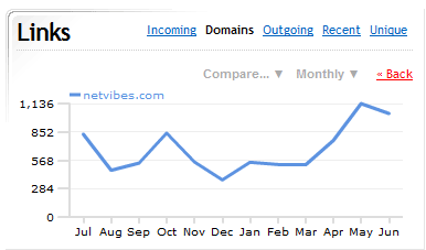
You can apply weekly or monthly view to the trend data for individual items as well. For example here is the monthly total of visitors to Clicky that came from netvibes.com:

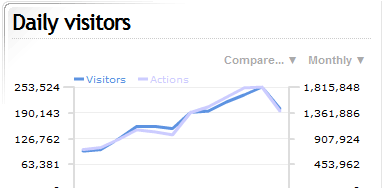
One other change for line graphs is that before when you compared two pieces of data, they used the same Y scale, which made it hard to compare the different data if one was in the thousands and the other in the tens or hundreds. So now when you compare two pieces of data, they each have their own Y scale, which makes it much easier to compare them. Here is monthly visitors vs actions for Clicky. In this case it does scrunch the data quite a bit since it’s in the millions, but for most people, for most views, this will never be the case.

Well, hope you like it! As seems usual for me these days, I don’t realize how useful something is until I can actually use it. Why didn’t I implement this earlier? Other than not enough time in the day, this seems like just one of those obvious oversights. Glad to have it in, finally. Seeing data summed up monthly for an entire year for any type of data (visitors, actions, or any individual search, page, etc) brings the service to a new level for me, and I hope for you too.

